Re-designing the browsing experience for online photography classes
Student project for strudel media Live
Timeline: September 2020
Role: UX researcher, prototyper and content strategist
The challenge:
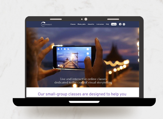
StrudelmediaLive offers online photography classes taught by experienced photographers. The owners wanted to update their site to attract younger students with diverse backgrounds. After surveying and interviewing target and current users, my team and I discovered several unmet user needs, and set out to streamline the browsing process and provide information that potential users found critical before they could sign up for a class.
The process:
Focusing on the usersMy team and I surveyed target users about their needs when signing up for an online photography class. Through this process, we learned more about the users' behaviors. We also discovered that before users could decide whether to invest money in a class, they needed more information about the instructors’ experience and the types of photos that had been previously produced through the classes. Using these insights, we developed two main personas who represented our target users.
We also conducted a usability test on the existing strudelmediaLive website with 4 target users and 2 current users. The users had a hard time finding classes that fit their availability, interests and skill levels, and registering for classes. They found the site “generic” and “cluttered.”

The solution
After drawing inspiration from websites for other organizations that offer in-person and online photography classes, we created a prototype that aimed to:
- provide users clear information about available classes and how to register
- improve navigation with a new site menu that conforms to users' expectations
- simplify the steps needed to register for classes
- improve users' reading experience with columns that accommodate their natural eye movement
Once we created the prototype, we repeated the same usability test with different users. Based on their feedback, we also:
- more clearly defined the skill level, time and day of each course on the class listings page, so that the information is more scannable
- highlighted the links to other sections of the site in the body of the homepage, to make them easier to find
The results
Users who tested the final design were able to easily figure out what kind of aid the organization’s two programs provided, how to sign up and how to participate. They were also able to complete the booking process on their own, and find out if they were eligible for free food aid. In the revamped design, users didn’t have to message or get confirmation from anyone from the organization to complete these tasks, requiring less effort and time required from users and staff than before.