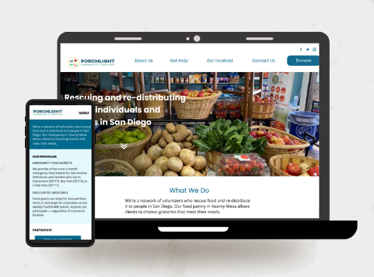
Food pantry website re-design
Client: Porchlight Community Services
Timeline: January to March 2020
Role: Solo UX researcher and UX/UI & visual designer
The challenge:
In early 2020, Porchlight Community Services, a food pantry based in San Diego, experienced an increase in requests from people in need of groceries. Their potential new clients were confused about what assistance was available, who qualified and how to sign up. At the same time, the volunteer staff was struggling to respond to dozens of messages each week -- both from new clients with questions and existing clients who needed to reserve a time to pick up groceries. The challenge was to re-design the organization’s outdated and underutilized website from the ground up, to deliver essential information about the programs available and allow their clients to easily sign up for help.
The process:
Focusing on the usersI recruited five of the organization’s clients for user interviews. Several pain points quickly emerged: when users went online to find out how to pick up for discounted groceries from the food pantry for the first time, the sign-up process was unclear. They couldn’t find out from the website how to schedule an appointment to get groceries, that they needed to pay, or where to go. Users also said they were unaware of the organization’s other program, which provides free emergency food, even though they might have been eligible.
Returning users also found the process of scheduling appointments cumbersome; they had to message a staff volunteer on Facebook to request a day and time, wait for confirmation, and then send a payment to the organization through Venmo.
Using these insights, I developed personas for new and returning users, and mapped their user journeys.
The solutionFor the MVP, I focused on 3 areas:
- Clear site navigation and writing that communicates how users can get help from the organization’s two programs
- A calendar system that allows users to make their own appointments and pay for groceries
- A screening tool that lets users to determine whether they’re eligible for free groceries
I also drew inspiration from websites for other organizations that provide food aid and social services and their tools for booking appointments and screening eligibility.
I tested a prototype with users and incorporated their feedback into the final design.
The results
Users who tested the final design were able to easily figure out what kind of aid the organization’s two programs provided, how to sign up and how to participate. They were also able to complete the booking process on their own, and find out if they were eligible for free food aid. In the revamped design, users didn’t have to message or get confirmation from anyone from the organization to complete these tasks, requiring less effort and time required from users and staff than before.